Illustrative people and places
This Assignment’s objective was to consolidate the learning acquired from previous exercises within part 3, to draw from observation with the objective of building a visual library and with that to help give ideas for illustrations.
The assignment was made up of two parts - Visual Research and Developing a narrative.
I went for a change of subject for this assignment.
Key points:
Visual research
- For this research I have decided to make a reportage drawing by going to a specific location such as a Pharmacy
- Gathered as much imagery as I could by going to the location and taking photographs from the interior and exterior of the location as well as gathering reference online.
- Can use considered drawings or descriptive
- Add notes or words
Developing a narrative
- Take some of my drawings and develop into a more narrative piece.
- Make a note of words to focus on and use as the basis of my illustration
- Aim is to deliberately create a piece of reportage that uses the combination of figures and location to describe an activity, building a sense of narrative to the words I have chosen.
- The elements might be connected or taken from different sources and put together.
- Think of a use for my drawing: A poster to promote an event or activity; An editorial illustration in a newspaper or magazine that describes the event or location ; a historical piece in a textbook for children that would be relevant to my location.
- Consider aspects of SCAMPER suited to my creative process.
Part 1 - Visual research:
For this visual research, I decided to choose another location/event for my sketches, in the spirit of documenting how some cogs in society are functioning during the current pandemic, I went to a local pharmacy to investigate how things changed by making quick sketches and taking photographs.
I made a self-brief as my compass before I went, with the following points:
- Make quick sketches to collect information about the figures and what they are doing, the location and any other elements that describe the activity or place.
- Try to gather as much imagery as I could
- To see my drawings as quick information
- Some drawings may be considered drawings or descriptive in other way
- Image may be sketchy or detailed.
Before I went on my journey, I looked through my archive of reportage artists in search of inspiration , I thought that a style such the one of artists below would be the best suited, with a mixture of informative text and quick-drawing style.
 |
| Wendy MacNaughton - Meanwhile in San Francisco - https://amp.theatlantic.com/amp/article/372279/ |
 |
| Olivier Kugler - Escaping Wars and Waves |
 |
| Mixture of photographs I took, the photographs that include people were found online. |
So with the the photographs I took and some other reference photos collected online I started my observational drawings in the spirit of fast and informative sketches.
The sketches were made on A3 paper.
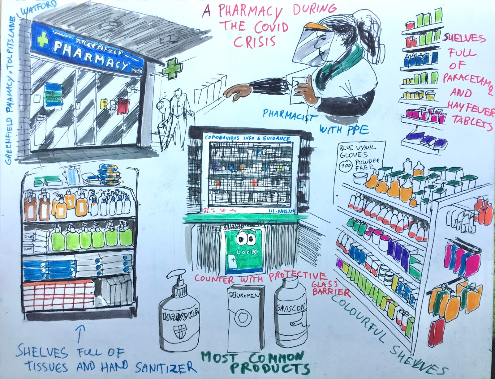 |
| A pharmacy during the Covid crisis - Pen and Tombow coloured brush markers on A3. (Forgot to mention the people queuing!) |
 |
| A sick man’s point of view - Pen and Tombow coloured brush markers |
Reflection
- Both drawings I see them as pieces of visual notation relevant to the established theme, the addition of notes and words gave another aesthetic dimension to the pictures.
- To be seen as pieces of reportage, I would probably change the colouring medium to digital for a better rendering and a more professional appearance and would further refine my pen marks to give a cleaner rendendering, these were made as fast drawings so I would take a slower approach.
- The second drawing, I would use it to build upon further but within a different context, using it in a graphic novel context.
Part 2 - Developing a narrative
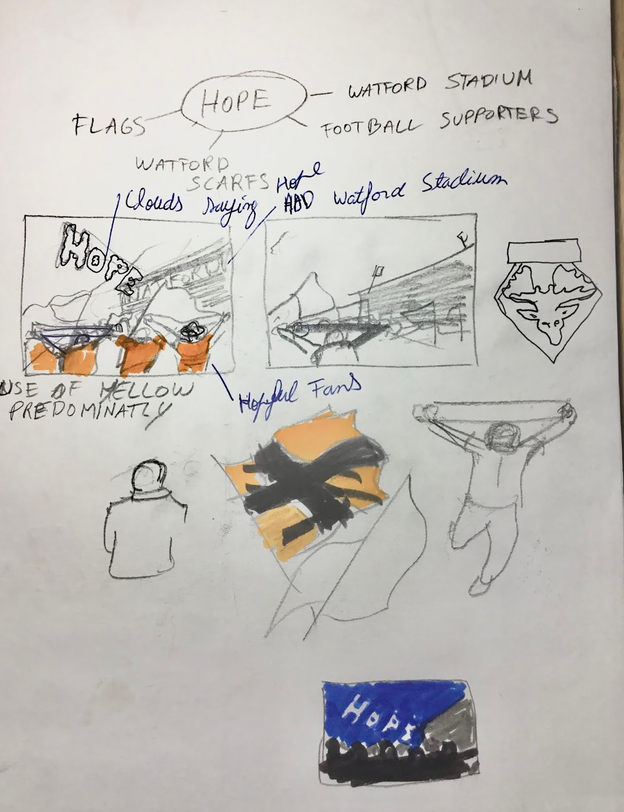
For this part I chose the picture of the Vicarage Road stadium to develop into a more narrative piece.

With this word I instinctively came up with an idea of a crowd of supporters walking towards the stadium, waving flags, raising their yellow scarves and singing. The idea of putting the word ”hope” in the clouds was because their are last in the Premier League and the idea of looking at the sky and dream that there’s still hope they don’t get relegated. The narrative is that the fans are going to see the last league match and there’s a “shine of hope”.
The aim was to deliberately create a piece of reportage that used the combination of figures and location to describe an activity that was lent by the words I have chosen. I was inspired by Veronica Lawlor and Brendan Higgins. Their quick drawing style would fit for the picture because of the energy and the feeling of “being there” in the location.
 |
| Veronica Lawlor |
 |
| Brendan Higgins - Allen St - Barry Town NYC |
 |
| Veronica Lawlor |
Development
The narrative illustration was drawn digitally using Procreate, using a pen and a round brush for colouring. The use of pen would help to create the sketchy lines of a fast drawing with its accidental lines. The choice of colour yellow, red and black are the club’s colours so I wanted them to be the predominant colours, the choice of blue was suggest the word “hope”.
The way the image ended up, a possible use of my drawing would be for a sports magazine or newspaper.
I collected
The elements of SCAMPER I used included Substitute, combine and put to another use.
I gave special attention to experimentation rather than a finished sketch.
Below is a sketch page which aided me with idea generation and has some thumbnail sketches for compositional arrangement of the elements (Sky, supporters and stadium).
The drawing had four layers, I started with light under drawing with a blue pencil, followed by another layer (Multiply mode) where a Pen was used. The colour layer went underneath the pen layer so I didn’t lose the pen marks.
  |
| Sketch page with thumbnail sketch and spider diagram and collection of visual references. |


I was split between these two drawings, but last one because of the use of shadow which gave the illusion of depth.
Below shows a time-lapse video of the process on Procreate. Again, this sketch was about experimenting and attempting to document the process rather than a finished drawing.
 |
| I made a sports magazine article using the drawing using a free magazine cover tool online called Canva. Changed the heading and added a subheading. |
Reflection
What were the main challenges you overcame when drawing in public places?
Being self aware of drawing in a public places, the idea that people think I was being pretentious and also people stopping to see what I’m drawing and not saying anything or afraid they said something unkind are the main fears which slowly are evaporating as I get more experienced.
Drawing at a cafe became a natural thing to me now, as the preconceived ideas I had were false.
During quarantine in this current pandemic, drawing in public places has been even more challenging, not much people are out on the streets and sketching calls too much attention.
Whilst trying to sketch inside the pharmacy, I felt so self-conscious since it was a very unusual place and I had to ask the clerk permission as well as the people queuing made the situation so awkward that I had to change plans by taking photographs and going back home, but these are unusual times which one has to adapt.
Has drawing in your sketchbook altered the way you think about how you use photography to document or record?
I’m still transitioning from photography to sketching as a source of reference. If I’m in a place where I can sit and have no time constraint then sketch is my primary visual research tool, whereas if I’m short of time, or i’m walking in a very crowded place then I have to resort to photography.
I still need photography to complement my sketches as a visual research tool because I don’t want to miss details which can be crucial towards the success of the picture I’m trying to make.
What materials suited you best when you were working on location?
A pen and a shading pen plus pocket sketchbook suited me best, it just became as natural as taking your keys and phone before you leave the house. The limitations however are that there’s no colours and it would be ideal to find a pocket sketchbook that can withstand watercolour without wrinkling the paper and a watercolour pad that’s portable enough to fit in my pocket.
Do you see your drawings as stand alone drawings or would you prefer to develop them in the studio situation?
Both, because some drawings I feel like there’s nothing else to add, the spontaneity and fast marks is what sells that particular drawing and there can be the occasion where the drawing after the first attempt still feels like it would be better with a different material, technique or stylistic approach and therefore needs to be developed in a studio situation.
How will you use your sketchbook drawings to lead to other ideas?
It helps me to build a visual library which has obvious benefits to the development of ideas and helps to better retain an idea which otherwise would be lost had I relied solely on memory.
It’s an invaluable tool to build mileage on you art skills and it shows all your successes and failures and makes you reflect on them.
A good technique I’m currently using is photographing a sketch which I drew an interesting idea, then with the Procreate app, I recoulour it to a non-photo blue colour, build a layer on top of that one and start refining the drawing .
Another method I found useful is to just scribble on the paper without any purpose, and then, like a Rorschach test, i look for lines which suggest an interesting idea.
Drawing thumbnails and making abstract layouts are methods which I’m slowly incorporating in my technique portfolio.
For someone who is writing a fiction graphic novel, a sketchbook is indispensable for character design, laying out pages and working compositions,etc.
Do you prefer working fast or slow?
I like using both. Some drawings look well with a fast drawing style and vice-versa. Starting a drawing working fast is crucial is you want to create a dynamic look for example when drawing a person performing an action or a superhero, but then working slow to refine it and give more thought to the drawing is equally important.
Working fast also leaves your emotional print in the picture in the way the marks are made, working slower, that identity can be lost. Nonetheless, to work fast and have your drawings look good takes skill and experience, In extreme examples, a toddler compared to an adult working fast perfectly illustrate the point.
For assignment three, I worked fast for different reasons, I was reaching my submission deadline and also the message the drawings portrayed required this approach.
Each drawing requires its own approach, depending on what I’m trying to achieve.
Are there qualities in the way you doodle that you can bring into your ideas within future work?
The are various qualities, some actually tested on exercise 3.5, the unpredictability is one of them, the letting go of your subconscious into the paper, the surrealness and dreamlike appearance;
Having a multitude of imagery spreaded through the paper, adding patterns and bypassing the worry of how will the drawing end up.
No comments:
Post a Comment