Here’s a list of the Illustrators sketchbooks I chose:
Consider the various ways that other illustrators respond to figures and environments.
From the illustrators i’ve chosen there’s a range in the way they respond to their environments where they can sketch exactly how things look and on other sketches they mix fantasy to the environment.
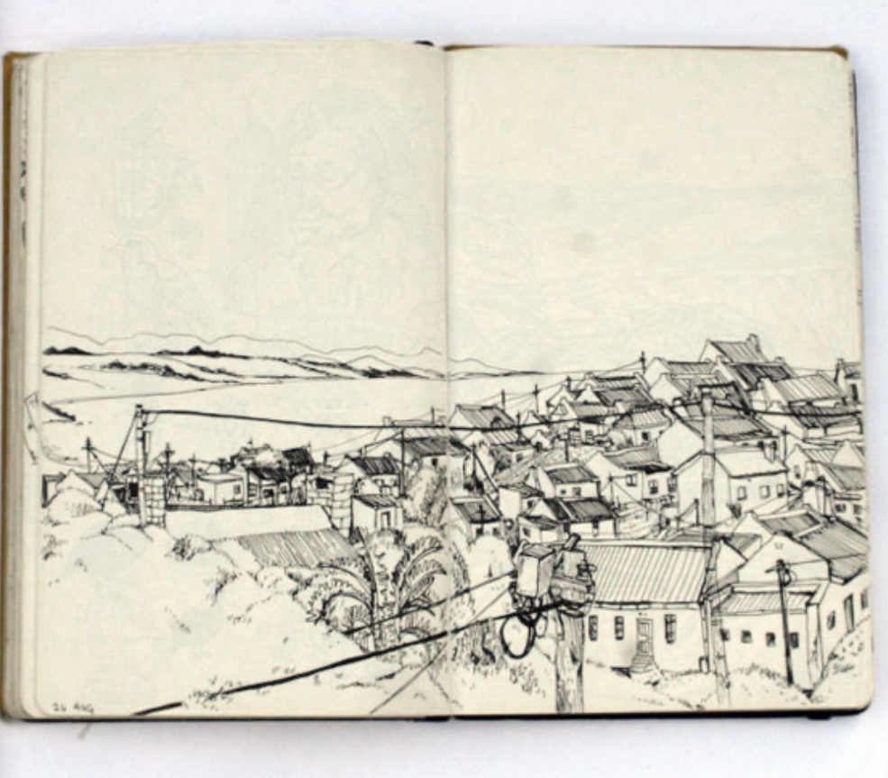
To answer this question I’m using Rohan Etsebeth and Mattias Adoflsson as my examples because they represent, to me at least, two extremes of how to portray reality in a sketchbook.
Rohan Etsebeth has a more realist approach to the way he sketches the environment whilst Mattias Adolfsson has a more fictional, fantasy-like approach to his sketches. One of the things they have in common is their use of perspective in the environments, to sketch buildings. In Mattias’ case, although he has a fictional approach in the sketches below, the sketches have some degree of believability as his use of two-point perspective seems accurate. In Rohan’s sketches he doesn’t wander away from his reference subjects.
 |
| http://www.book-by-its-cover.com/sketchbooks/sketchbook-series-mattias-adolfsson |
 |
| http://www.book-by-its-cover.com/sketchbooks/sketchbook-series-mattias-adolfsson |
 |
| http://www.book-by-its-cover.com/sketchbooks/sketchbook-series-rohan-etsebeth |
 |
| http://www.book-by-its-cover.com/sketchbooks/sketchbook-series-rohan-etsebeth |
What materials do they use?
All of the artists I’ve chosen, use a drawing pen like a Pigma Micron and a brush pen for their sketches in general, they also use to a lesser degree, watercolours and grey markers or inkwash for shading. There is one or two sketches where they seem to be using acrylic as well.
Do they sketch quickly or are the drawings more sustained?
The majority of them have more sustained approach to their drawings,
If they draw fast, how is this achieved- how is the content edited?
When they draw fast, for example, sketching people outdoors, they make decisions into what to leave in or out, they could just focus on sketching the face, leave it as it is or they could add some an astronaut suit or have the body of an animal. They can also, instead of giving realism by being overly detailed in rendering the figure, they draw minimal lines, exaggerate their proportions or give a cartoon-like appearance (Joe Tallarico), focusing on the most noticeable traits of the person they’re sketching.
There are quite a few sketches from my list that they seem like spontaneous drawings, where they don’t use reference, they instead start making a random line and see where it goes from there, creating opportunities for happy accidents.
Which subjects or parts of the images are edited or stylised?
In general, they all edit and stylise the human figure, some of them give it a cartoon like appearance by drawing ,for example, the head with the shape of a sphere, or a more triangular shape. They also can distort their proportions by giving small arms and long legs, no neck, a huge mouth, varying the distance between both eyes, put the human face on a dinosaurs body, giving unrealistic attributes.
On other sketches, they give a more realistic appearance, but focus on drawing the upper body, leaving the legs or arms out. There are other sketches where they make a realistic human body with the face of an ostrage. These are based on the artists I’ve chosen , they seem to gain an identity in the way they stylise their characters.


How does the stylisation affect the communication process and the sense of documentary?
The degree of stylisation has the role of directing the attention towards the narrative of the sketch rather than focusing on how well rendered the drawing is. Taking Matthias Adolfsson as example, he draws his figures so they harmonise with the environment to the benefit of the theme he describes on the image. A more realistic figure but with jagged and rough line work can give the reader a sense of unease or anxiety and a more gentle line work can give opposite reaction like a feeling of comfort .
Are there any parts of the images that are unfinished and what impact does it have on the overall image?
 |
| http://www.book-by-its-cover.com/sketchbooks/sketchbook-series-joe-tallarico |
 |
| http://www.book-by-its-cover.com/sketchbooks/sketchbook-series-john-hendrix |
Taking the sketches from Joe Tallarico and John Hendrix (above) as examples, these two sketches look unfinished in the way that they didn’t complete the full figure, rather they only filtered elements that would help to create a mood or story to the sketch. On Joe’s sketch, the face drawings can inform me that they’re commuting to work or they’re on their everyday routine.
John’s sketch seems unfinished, but I can deduct by their facial expression a sense of boredom.
I think that a group of unfinished sketches on a page gives the illusion of fragments, like thought bubbles that occur whilst you’re sketching and that can have an effective visual aesthetic in a sketch.
John’s sketch seems unfinished, but I can deduct by their facial expression a sense of boredom.
I think that a group of unfinished sketches on a page gives the illusion of fragments, like thought bubbles that occur whilst you’re sketching and that can have an effective visual aesthetic in a sketch.
Are there some images that you think communicate better when drawn slowly?
No, because if they were drawn slowly, it would transmit a different story from the initial idea. By drawing slowly, the initial information tends to dissolve. From the artists chosen, I can’t give an example but using life drawing as reference, doing a 30 second sketch, requires you to capture the information that’s essential to inform what the subject is doing, to do that, you use a more instinctive approach rather than analytical. By drawing slowly, part of energy the sketch initially had, fades away and the end result at times can become lifeless.
No comments:
Post a Comment